Context
When the confinement measures started in Canada, we were contacted by Dialogue, a telemedicine provider, to help them migrate Chloe, their Covid-19 rule-based chatbot, to a conversational chatbot, using Rasa, and add new functionalities to the bot. This would be a 10 weeks, agile, iterative project.
Here are Chloe’s high-level functionalities:
- Self-assessment: provide personalized recommendations based on one’s symptoms and following federal and provincial recommendations
- Question-Answering (Q&A): allow the user to ask Covid-19 related questions using a model developed by Mila
- Daily check-in: help the users monitor their symptoms day by day. If the user subscribed to the daily check-in, they receive a link by SMS once a day to connect to Chloe and assess the progression of their symptoms
- Screening/testing sites navigation: using their postal code, provide user with a list of testing sites near them with Clinia’s API
The design was made iteratively as we added functionalities, and adjusted to account for comments from Dialogue’s doctors and volunteer testers, constantly moving. The implementation followed not so far behind. There are lots of possibilities on how to implement some dialogue patterns with Rasa, and with the ever-changing designs, our implementation choices often felt like navigating a labyrinth. We made it to the exit, but not without turning back a couple of times before hitting a wall or to avoid a cliff. Without an overview of the final design, we ended up with some inconsistent implementations, and without infinite time, some incomplete refactors. But this context also led us to explore paths we wouldn’t have with Rasa if we’d had the time to identify patterns and create generic components to apply them.
In this post and the next one of this short series, I will tell the tale of how we developed Chloe. For each step of our course, I will describe the main obstacles we faced, and the implementation decisions we made, often in the heat of the moment. In this first installment, we will mostly focus on the self-assessment and daily check-in flows.
Episode 1: Assessment Flows

Scene 1: Sprint to the First Assessment Demo
Very early in the project (i.e. day 8), we were asked if we could demo an assessment flow at the end of the day. When the request for a demo came, the first design was still boiling in our designer’s head; we had a running Rasa project but no dialogue implemented. Nonetheless, we rolled up our sleeves and made it happen.
The initial demo was a simple decision tree to find out the gravity of the user’s symptoms and make appropriate recommendations. We took the straightest path forward: augmented memoization policy with a story representing each possible path. We used buttons and blocked the text input field so we wouldn’t need to train an NLU model or handle unhappy paths.
Scene 2: The Path Becomes Muddy as Assessment Flows Multiply
The next major increment in the flows was to add a distinction, at the entry point of the self-assessment flow, between three situations:
- The user thinks they might be sick and wants to assess their symptoms (initial case)
- The user has been tested positive and wants to assess their symptoms and get advice
- The user has done the self-assessment before and comes back to reassess their symptoms
This distinction created several variations in the basic flow, such as asking if the symptoms worsened in the case of a reassessment, or starting with self-isolation recommendations for someone who tested positive.
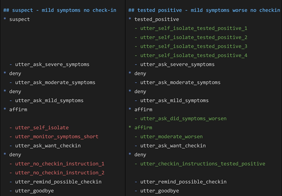
We continued on the same path, adding stories to implement these two new flows, although we started noticing the quickly growing number of stories for only three flows (that would continue complexifying) and the repetitions between similar paths.
Two similar stories for a user with mild symptoms
Seeing no simple solution to this in stories – checkpoints and ORs could not help because the similar parts are sandwiched between the different intents and the variations they create – we didn’t make any significant implementation change at this point.
While implementing those three flows, we needed to add a change that applied to all three: after the user says they don’t have severe symptoms, Chloe collects their province of residence and age, to make more precise recommendations. This time, the straightforward path was to put these pieces in a form: we collect information, and it is easily reusable in all our stories.
Scene 3: Fast Lane to Daily Check-In Enrollment
Moving on to another functionality, we implemented the daily check-in enrollment; if the user shows symptoms, Chloe offers the daily check-in. If the user accepts, she collects their name and phone number, notes if they have preconditions that make them more susceptible to complications, etc. This flow was also without a doubt a form. In this first simple version, even though we used free text to collect the first name and phone number, there was no real error-handling: we used the complete user input for the name and extracted all the digits of the input for the phone number, re-asking for it if there were not 10 or 11 digits.
Scene 4: Answering Questions and Following TED
The Q&A functionality is meant to allow the user to ask any question they have about Covid-19, and send that question to the module developed by Mila, receive a response and display it to the user. We wanted to make this feature available in every flow, with different paths leading to it and different paths leading out of it depending on the type of outcome (the different types of outcome will be described, as well as the details of this feature and its evolution, in the next installment of this post).
Since Chloe would not offer an assessment if any type of assessment had already been done in the conversation, the transitions after the Q&A also depended on this fact, multiplying the outward paths. Memoization wouldn’t suffice to learn this difference since we could loop in Q&As over and over. Thus, we added a “self_assess_done” featurized slot combined with assessment+Q&A stories and counted on the TED policy to learn with few examples. It worked, but our stories file grew a lot suddenly.
Intermission: Backtracking to Forms to Avoid a Stories Jungle
Foreseeing this coming multiplication and lengthening of our stories, we decided to transfer the common part of the assessments to a form before completely integrating the Q&As. This would shorten and simplify stories, but also ease the collection of slots (presence of cough or fever, newly added as a separated question, and the degree of symptoms), necessary if the user subscribed to daily check-in. A form meant less repetition but also using intermediary disposable slots to allow the tree-like filling of a single slot to cover the degree of symptoms. The slot was featurized to adapt the daily check-in offer and recommendations after the form in stories.
But this unique assessment form did not last long; the design changed while we were looking away. Two recommendation messages, about self-isolation and home assistance, were replaced by small flows with one question each. The design and implementation around these moved a lot. First, both flows were forms, inserted where the corresponding message was. Then we had to triplicate the assessment form to insert the self-isolation subflow, either before, after or in the middle of it depending on the situation (regular assessment, tested positive or reassessing). Later, the self-isolation flow was moved and modified for each situation, but we kept three separate forms to gradually include the specific questions that were left out of the common version. We kept code in common, but the “how” varied over time, and more details will be given on this subject as the question of modularity will be touched in another post.
At this point, our general model used a combination of stories, forms and actions that can be summarized as follows:
- Stories: transition between main flows and subflows, define the sequences of forms, conditions and actions that are possible for each main functionality and high-level flow
- Forms: collect pieces of information and define decision trees, handle reusable subdialogues that include at least one question, etc.
- Actions: various uses that do not require the collection of information, including displaying multiple messages in a row.
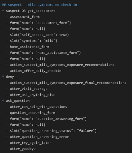
Here is an example of a story at this moment:
Basic self-assessment flow followed by a question
Scene 5: Daily Check-In; Another type of Assessment, a Known Path
The purpose of the daily check-in is to contact the user (who previously enrolled) everyday to assess their symptoms and, among other things, evaluate the progression of these symptoms. An initial question allows to establish which of three situations applies to the user: they feel better than the day before, they feel worse, or there were no changes. Each situation had its own decision tree, and each one of these had variations depending on the symptoms of the day before. While some questions were asked in each flow, overall, there were not enough similarities to reuse significant portions of the dialogue. Therefore, with the experience we had in implementing self-assessment flows, we knew that the better way to implement the daily check-in flows would be through three separate forms.
Scene 5.5: Daily Check-In all the Way
There was far more than the assessment to the daily check-in: an “invalid URL” flow (id in URL sent to the user to access the daily check-in does not exist), a one-click offer to opt-out before the assessment, another one, varying depending on that day’s symptoms, after the assessment, and a set of recommendations at the end. The invalid URL flow was added as stories because it merely directed to other features. The opt-out options were added as other forms since we collected information and had to call our database. The recommendations started as an action to remain separated as a different flow, called as a followup action when necessary in the daily-ci end keep-or-cancel form. Then we realized that followup actions still had to appear in stories, and when we added the transitions to other functionalities, it made more sense to directly include the recommendations in the form instead.
In the Next Episode
In this first installment, we described how we used stories and forms to implement the many variants of the self-assessment and daily check-in flows. While stories were appropriate at first to define simple decision trees with few branches, it quickly became obvious that they are not the best tool to implement complex decision trees, conditional branching or reusable subflows. We therefore had to create several forms that were embedded in stories, and rely on stories to manage higher-level flows.
In the next steps of the project, we built on the initial functionalities to add the following features:
• We expanded and improved the Q&A flows
• We added the testing sites navigation
• We added NLU support, first to portions of the flows, and ultimately everywhere
These additions brought new challenges in how we used Rasa, not only in defining and developing the dialogue but also in incorporating NLU and ensuring its performance and accuracy were adequate.
The next installment of this series will explore these topics.


